November 19, 2018, 7:29 am
Stimulsoft Reports.NetAdds support for Custom styles in maps.
Features
- WinForms StyleEditor. Added More Options button to show/hide advanced settings.
- Report checker now detects incorrect initialization values for variables.
- Added support for Custom styles in maps.
- Simple viewer window is now used by the report designer when previewing reports via Shift + F5.
- Improvements when selecting table element columns.
Fixes
- Extra input field for expression in IsBlank filters in transformations.
- Incorrect automatic type for the Measure column in transformation.
- Custom styles incorrectly drawn in Ribbon.
- When changing a map custom style is was not reset and the component was not drawn correctly.
- Problem with Shift-F5 shortkey in the designer when a report closed.
↧
November 19, 2018, 7:31 am
Stimulsoft Reports.WpfReport checker now detects incorrect initialization values for variables.
Features
- Report checker now detects incorrect initialization values for variables.
Fixes
- When saving a report and reopening it, the connected data was not overwritten into a new report.
- Problem with Shift-F5 shortkey in the designer when a report was closed.
↧
↧
November 19, 2018, 7:34 am
Stimulsoft Reports.JSAdds a Zoom property to the Designer.
Features
- Added Zoom property to the Designer.
Fixes
- Bug in the Text Format form.
↧
November 19, 2018, 9:00 am
Stimulsoft Reports.WebAdds a Zoom property to Designer.
Features
- Added Zoom property to the Designer.
- Report checker now detects incorrect initialization values for variables.
Fixes
- Bug in Text Format form.
- The e.IsNewReport save event property does not work in the HTML5 designer.
- Problem with Shift-F5 shortkey in the designer when a report was closed.
↧
November 19, 2018, 9:02 am
Stimulsoft UltimateAdds a Zoom property to the Designer, plus support for custom styles in the Chart, Gauge & Map elements.
Features
- Initial Range Selection property added to date picker element.
- Clone items by pressing the Control key when dragging.
- WinForms StyleEditor. Added More Options button to show/hide advanced settings.
- Added Clear Formatting button to text element editor.
- Added TextFormat for pivot elements.
- Added support for selecting custom styles in Chart, Gauge, Map elements.
- Added Zoom property to the Designer.
- Report checker now detects incorrect initialization values for variables.
- Added support for Custom styles in maps.
- Simple viewer window is now used by the report designer when previewing reports via Shift + F5.
- Improvements when selecting table element columns.
- Added Clear Contents action for text elements in dashboards.
- Added 'Copy' to table element context menu in dashboard viewer.
- Added support for copying fields using the Control key.
- StyleEditor. Improvements in drawing styles.
↧
↧
November 20, 2018, 4:55 am
New features in Wijmo 2018 v3 .Wijmo Core adds Web Workers, new OLAP features, a Ribbon sample, accessibility improvements and more.
Features
Updates in Wijmo Core 2018 v3
- Faster PDF Export with Web Workers
- PDF export can often slow down web apps: since the export is happening in the browser’s UI thread, it can cause the rest of the application to be unusable. This is where Web Workers comes to the rescue. We used Web Workers to process the exporting of PDF files on a separate thread from the application UI. This allows the applications to stay usable and the PDF export to churn along in the “background”.
- Group Headers in ComboBox/ListBox
- We've added a showGroups property that you can use to add group headers to ListBox and ComboBox controls. Group header items are added if the showGroups property is set to true and the itemsSource collection has grouping enabled.
- Ribbon Sample using TabPanel
- We’ve added a ribbon sample that shows how you can create ribbons easily using the TabPanel control and the controls in Wijmo's input module.
- The ribbon element is a TabPanel. The tab pages contain groups of controls arranged in rows and columns. Controls in the groups use Material Icons, and have tooltips created automatically based on the aria-label attribute assigned to each control.
- Slicer for OLAP
- We have added a Slicer control to our OLAP module. The Slicer control provides a quick way to edit filters applied to PivotField objects.
- It provides buttons the user can click to filter data based on values and indicates the current filtering state, which makes it easy to understand what is shown in filtered PivotGrid and PivotChart controls.
- Detail Dialog API in OLAP
- The Wijmo PivotGrid allows you to drill down into cells to see the data items that were used to calculate each summary. Users can invoke the detail dialog by double-clicking any value cell. You can also invoke the detail dialog by calling the grid's showDetail method and passing the coordinates of the cell.
- Now, the grid exposes the detail dialog through its detailDialog property, which can be used to customize the dialog.
- Calculated Fields in OLAP
- We also added a PivotField.getValue property to OLAP that allows you to specify a custom function to be used for retrieving the field value for a given item. You can use this to implement calculated fields such as 'binning' (e.g. Value => large/medium/small) or calculated expressions (e.g Conversion => downloads/sales).
- Year Picker in Calendar
- We added a small but useful feature in our Calendar and InputDate controls. You can now click on the year header to open a year picker that allows you to much more easily jump to different years. This little enhancement should save your end users some time when selecting dates.
- Submenu Support Added to Menu
- We got this request from a customer and thought it was a great idea. Our Menu control now supports adding multiple submenus to it so that you can create more complex menus and context menus. We also added an option to open menus on hover.
- Looking for Angular 7 Support?
- We're very excited about Angular 7, and as you know, Wijmo has first-class Angular support. We're happy to announce that Wijmo supports Angular 7, so you can use the current version of Wijmo to build Angular 7 applications today.
- New Samples
- WebComponentsIntro
- MyBI
- Ribbon Control Example
- Slicer for OLAP
- OLAP Detail Dialog
- Group Headers in ComboBox
- HierarchicalMenu
↧
November 21, 2018, 7:06 am
New Material Theme Designer in C1 Studio for WinForms.New Material Theme Designer, Sparkline control and FlexGrid integration, plus DataFilter control beta release.
Features
- New Material Theme Designer - In addition to adding Material, Material Dark, and Office 2016 Excel Green themes, WinForms now features a Material Theme Designer sample that allows you to set the primary and accent colours of Material theme and save\load them in C1themes format.
- New DataFilter control (beta) - A powerful UI addition, the DataFilter provides an easy, ecommerce-like filter to accompany any data-aware control. You can create filters from datasources, autogenerated, or create them manually. The accordion-based filtering UI can be attached to any control sharing a datasource or plugged into an info screen. The DataFilter is in beta mode and will be launched in 2019 v1.
- New Sparkline control and FlexGrid integration - This lightweight sparkline chart control represents the general shape of data variation in a condensed visual. It's often embedded in grids, and as such, FlexGrid can now display sparklines in columns, and it's now easier to plot trends inside FlexGrid cells. The sparkline property of the FlexGrid column supports plotting line, column, and WinLoss sparklines. You can further customize these sparklines by setting the Axis, markers, and series colours among others.
- FlexGrid now supports SortInfo and GroupInfo, so column information can now be saved and loaded.
- Scheduler's table and agenda views are now launched and out of beta.
- FlexChart now supports animation when loading, updating, and adding new data.
↧
November 21, 2018, 7:06 am
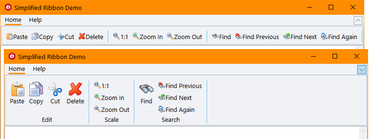
Simplified Ribbon Control in C1 Studio for WPF.Adds Simplified Ribbon contol, new FlexGrid101 Samples, customized icons, plus updates to Scheduler.
Features
- Simplified WPF Ribbon - Improve the look and navigation of your WPF apps with the modern, minimalistic simplified ribbon. This new control occupies the middle ground between a ribbon a toolbar, providing a single-line collapsed state, or a three-line ribbon-like appearance, and its design is influenced by Microsoft's ever-evolving Office 365 ribbon. You can customize the style of the ribbon, as well as the buttons you'd like to include.
- FlexGrid101 Samples - Added a new C1Icon that enables a new level of customization for the sort, filter, and grouping glyphs, as well as FlexGrid101 samples to make it even easier to get started with this popular control. They demonstrate features like selection, cell customization, conditional formatting, filtering, the RowDetails feature, cell merging, and many other points of interest.
- C1Icon - A new object that is used within the FlexGrid to make it much easier to customize the many icons used throughout for sorting, filter, etc. C1Icon allows you to specify your own image, font character, or use a built-in template to change the appearance of the icons found in the data grid.
- Scheduler Updates:
- New TableView Scheduler sample displays appointments in a table view that can be grouped, sorted, or filtered as specified by the developer or end user. It's similar to the Outlook 2016 List and Active views:
- AgendaView displays appointments grouped by date in a table view where a single table row represents a single appointment. Users can edit appointments by double-clicking on an appointment and opening the EditAppointment dialog. This view is always sorted by dates in ascending order, and doesn't have row or column headers.
- New "Working Elsewhere" appointment availability status has been added.
- FlexChart Updates:
- Animations - FlexChart and Finanical Chart now has animations for loading, updating, and changes to the chart axes. You can also create your own custom animations using the AnimationTransform event.
- Scale Breaks - FlexChart has also been updated to support axis scale breaks. Scale breaks can make irregular data that varies by a large magnitude easier to read as it makes the lower end of the scale more visible.
- Ranged drawing mode - allows support for built-in floating bar and Gantt charts. Ranged drawing mode is available for Bar, Column, and Area Charts.
- UWP controls are now available through NuGet.
↧
November 21, 2018, 7:06 am
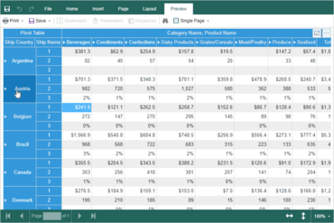
New Flight Statistics sample in C1 Studio ASP.NET MVC.Adds new Flight Statistics sample, Group Items in ComboBox and ActiveReports support to FlexViewer.
Features
- New Control Designer for ASP.NET MVC - With the newly-enhanced scaffolders, you can use the control wizard to configure controls when you're not using Entity Framework and generate code for a C1 MVC control. In addition to inserting a new control, this now supports updating an existing control definition using the wizard. This wizard can be invoked through the context menu or through Quick Actions in Razor view. This feature is supported in ASP.NET MVC and ASP.NET Core MVC.
- New Flight Statistics Sample - This dashboard-style sample displays flight performance data over time. Controls include FlexGrid with sparkline columns for delay trend and KPI columns. A treemap, bar chart, and line symbol chart are used in to display region-wide statistics, and users can drill down to a specific region and city by selecting the data points. On clicking a region in the Total Flights TreeMap, the FlexGrid displays the details of that region.
- Group items in ComboBox - From the user request folder! With CollectionView already supporting grouping, ComboBox grouping could be implemented with some custom code, but we added this as a simple property in the control itself:
- ActiveReports added to FlexViewer - In addition to FlexViewer's support for ActiveReports, a new Item Template allows you to quickly configure the viewer in your ASP.NET MVC app.
- DashboardDemo updated with Material Design - The DashboardDemo has been updated to include Material Design principles and color schemes. In addition, the DashboardLayout control has been added to the dashboard and analysis tabs.
- FlexGrid Enhancements:
- Use ColumnGroupProvider to create multi-level merged-cell column headers for groups of related columns.
- FlexGrid AccessibilityExtender can be used to easily extend accessibility support in one of two ways; Resize columns using the keyboard (alt+left/right keys). Provide an "alert" method that changes the content of an invisible element with the role "alert." This allows assistive tools to announce grid actions like sorting and filtering.
↧
↧
November 21, 2018, 7:06 am
ComponentOne Studio UWP FlexChartsNew animations for FlexChart and Financial Chart, plus ranged drawing mode for Bar, Column and Area Charts.
Features
- Simplified WPF Ribbon - Improve the look and navigation of your WPF apps with the modern, minimalistic simplified ribbon. This new control occupies the middle ground between a ribbon a toolbar, providing a single-line collapsed state, or a three-line ribbon-like appearance, and its design is influenced by Microsoft's ever-evolving Office 365 ribbon. You can customize the style of the ribbon, as well as the buttons you'd like to include.
- FlexGrid101 Samples - Added a new C1Icon that enables a new level of customization for the sort, filter, and grouping glyphs, as well as FlexGrid101 samples to make it even easier to get started with this popular control. They demonstrate features like selection, cell customization, conditional formatting, filtering, the RowDetails feature, cell merging, and many other points of interest.
- C1Icon - A new object that is used within the FlexGrid to make it much easier to customize the many icons used throughout for sorting, filter, etc. C1Icon allows you to specify your own image, font character, or use a built-in template to change the appearance of the icons found in the data grid.
- Scheduler Updates:
- New TableView Scheduler sample displays appointments in a table view that can be grouped, sorted, or filtered as specified by the developer or end user. It's similar to the Outlook 2016 List and Active views:
- AgendaView displays appointments grouped by date in a table view where a single table row represents a single appointment. Users can edit appointments by double-clicking on an appointment and opening the EditAppointment dialog. This view is always sorted by dates in ascending order, and doesn't have row or column headers.
- New "Working Elsewhere" appointment availability status has been added.
- FlexChart Updates:
- Animations - FlexChart and Finanical Chart now has animations for loading, updating, and changes to the chart axes. You can also create your own custom animations using the AnimationTransform event.
- Scale Breaks - FlexChart has also been updated to support axis scale breaks. Scale breaks can make irregular data that varies by a large magnitude easier to read as it makes the lower end of the scale more visible.
- Ranged drawing mode - allows support for built-in floating bar and Gantt charts. Ranged drawing mode is available for Bar, Column, and Area Charts.
- UWP controls are now available through NuGet.
↧
November 21, 2018, 7:07 am
Material Theme Designer and ASP.NET MVC Control Wizard.New WinForms Material Theme Designer, Simplified Ribbon contol for WPF and Control Wizard for ASP.NET MVC.
Features
Updates in WinForms
- New Material Theme Designer - In addition to adding Material, Material Dark, and Office 2016 Excel Green themes, WinForms now features a Material Theme Designer sample that allows you to set the primary and accent colours of Material theme and save\load them in C1themes format.
- New DataFilter control (beta) - A powerful UI addition, the DataFilter provides an easy, ecommerce-like filter to accompany any data-aware control. You can create filters from datasources, autogenerated, or create them manually. The accordion-based filtering UI can be attached to any control sharing a datasource or plugged into an info screen. The DataFilter is in beta mode and will be launched in 2019 v1.
- New Sparkline control and FlexGrid integration - This lightweight sparkline chart control represents the general shape of data variation in a condensed visual. It's often embedded in grids, and as such, FlexGrid can now display sparklines in columns, and it's now easier to plot trends inside FlexGrid cells. The sparkline property of the FlexGrid column supports plotting line, column, and WinLoss sparklines. You can further customize these sparklines by setting the Axis, markers, and series colours among others.
- FlexGrid now supports SortInfo and GroupInfo, so column information can now be saved and loaded.
- Scheduler's table and agenda views are now launched and out of beta.
- FlexChart now supports animation when loading, updating, and adding new data.
Updates in WPF and UWP
- Simplified WPF Ribbon - Improve the look and navigation of your WPF apps with the modern, minimalistic simplified ribbon. This new control occupies the middle ground between a ribbon a toolbar, providing a single-line collapsed state, or a three-line ribbon-like appearance, and its design is influenced by Microsoft's ever-evolving Office 365 ribbon. You can customize the style of the ribbon, as well as the buttons you'd like to include.
- FlexGrid101 Samples - Added a new C1Icon that enables a new level of customization for the sort, filter, and grouping glyphs, as well as FlexGrid101 samples to make it even easier to get started with this popular control. They demonstrate features like selection, cell customization, conditional formatting, filtering, the RowDetails feature, cell merging, and many other points of interest.
- C1Icon - A new object that is used within the FlexGrid to make it much easier to customize the many icons used throughout for sorting, filter, etc. C1Icon allows you to specify your own image, font character, or use a built-in template to change the appearance of the icons found in the data grid.
- Scheduler Updates:
- New TableView Scheduler sample displays appointments in a table view that can be grouped, sorted, or filtered as specified by the developer or end user. It's similar to the Outlook 2016 List and Active views:
- AgendaView displays appointments grouped by date in a table view where a single table row represents a single appointment. Users can edit appointments by double-clicking on an appointment and opening the EditAppointment dialog. This view is always sorted by dates in ascending order, and doesn't have row or column headers.
- New "Working Elsewhere" appointment availability status has been added.
- FlexChart Updates:
- Animations - FlexChart and Finanical Chart now has animations for loading, updating, and changes to the chart axes. You can also create your own custom animations using the AnimationTransform event.
- Scale Breaks - FlexChart has also been updated to support axis scale breaks. Scale breaks can make irregular data that varies by a large magnitude easier to read as it makes the lower end of the scale more visible.
- Ranged drawing mode - allows support for built-in floating bar and Gantt charts. Ranged drawing mode is available for Bar, Column, and Area Charts.
- UWP controls are now available through NuGet.
Updates in ASP.NET MVC
- New Control Designer for ASP.NET MVC - With the newly-enhanced scaffolders, you can use the control wizard to configure controls when you're not using Entity Framework and generate code for a C1 MVC control. In addition to inserting a new control, this now supports updating an existing control definition using the wizard. This wizard can be invoked through the context menu or through Quick Actions in Razor view. This feature is supported in ASP.NET MVC and ASP.NET Core MVC.
- New Flight Statistics Sample - This dashboard-style sample displays flight performance data over time. Controls include FlexGrid with sparkline columns for delay trend and KPI columns. A treemap, bar chart, and line symbol chart are used in to display region-wide statistics, and users can drill down to a specific region and city by selecting the data points. On clicking a region in the Total Flights TreeMap, the FlexGrid displays the details of that region.
- Group items in ComboBox - From the user request folder! With CollectionView already supporting grouping, ComboBox grouping could be implemented with some custom code, but we added this as a simple property in the control itself:
- ActiveReports added to FlexViewer - In addition to FlexViewer's support for ActiveReports, a new Item Template allows you to quickly configure the viewer in your ASP.NET MVC app.
- DashboardDemo updated with Material Design - The DashboardDemo has been updated to include Material Design principles and color schemes. In addition, the DashboardLayout control has been added to the dashboard and analysis tabs.
- FlexGrid Enhancements:
- Use ColumnGroupProvider to create multi-level merged-cell column headers for groups of related columns.
- FlexGrid AccessibilityExtender can be used to easily extend accessibility support in one of two ways; Resize columns using the keyboard (alt+left/right keys). Provide an "alert" method that changes the content of an invisible element with the role "alert." This allows assistive tools to announce grid actions like sorting and filtering.
↧
November 21, 2018, 7:08 am
ComponentOne UltimateNew Simplified Ribbon for WPF, Control Wizard for ASP.NET MVC, plus updates to WinForms and UWP controls.
Features
Updates in WinForms
- New Material Theme Designer - In addition to adding Material, Material Dark, and Office 2016 Excel Green themes, WinForms now features a Material Theme Designer sample that allows you to set the primary and accent colours of Material theme and save\load them in C1themes format.
- New DataFilter control (beta) - A powerful UI addition, the DataFilter provides an easy, ecommerce-like filter to accompany any data-aware control. You can create filters from datasources, autogenerated, or create them manually. The accordion-based filtering UI can be attached to any control sharing a datasource or plugged into an info screen. The DataFilter is in beta mode and will be launched in 2019 v1.
- New Sparkline control and FlexGrid integration - This lightweight sparkline chart control represents the general shape of data variation in a condensed visual. It's often embedded in grids, and as such, FlexGrid can now display sparklines in columns, and it's now easier to plot trends inside FlexGrid cells. The sparkline property of the FlexGrid column supports plotting line, column, and WinLoss sparklines. You can further customize these sparklines by setting the Axis, markers, and series colours among others.
- FlexGrid now supports SortInfo and GroupInfo, so column information can now be saved and loaded.
- Scheduler's table and agenda views are now launched and out of beta.
- FlexChart now supports animation when loading, updating, and adding new data.
Updates in WPF and UWP
- Simplified WPF Ribbon - Improve the look and navigation of your WPF apps with the modern, minimalistic simplified ribbon. This new control occupies the middle ground between a ribbon a toolbar, providing a single-line collapsed state, or a three-line ribbon-like appearance, and its design is influenced by Microsoft's ever-evolving Office 365 ribbon. You can customize the style of the ribbon, as well as the buttons you'd like to include.
- FlexGrid101 Samples - Added a new C1Icon that enables a new level of customization for the sort, filter, and grouping glyphs, as well as FlexGrid101 samples to make it even easier to get started with this popular control. They demonstrate features like selection, cell customization, conditional formatting, filtering, the RowDetails feature, cell merging, and many other points of interest.
- C1Icon - A new object that is used within the FlexGrid to make it much easier to customize the many icons used throughout for sorting, filter, etc. C1Icon allows you to specify your own image, font character, or use a built-in template to change the appearance of the icons found in the data grid.
- Scheduler Updates:
- New TableView Scheduler sample displays appointments in a table view that can be grouped, sorted, or filtered as specified by the developer or end user. It's similar to the Outlook 2016 List and Active views:
- AgendaView displays appointments grouped by date in a table view where a single table row represents a single appointment. Users can edit appointments by double-clicking on an appointment and opening the EditAppointment dialog. This view is always sorted by dates in ascending order, and doesn't have row or column headers.
- New "Working Elsewhere" appointment availability status has been added.
- FlexChart Updates:
- Animations - FlexChart and Finanical Chart now has animations for loading, updating, and changes to the chart axes. You can also create your own custom animations using the AnimationTransform event.
- Scale Breaks - FlexChart has also been updated to support axis scale breaks. Scale breaks can make irregular data that varies by a large magnitude easier to read as it makes the lower end of the scale more visible.
- Ranged drawing mode - allows support for built-in floating bar and Gantt charts. Ranged drawing mode is available for Bar, Column, and Area Charts.
- UWP controls are now available through NuGet.
Updates in ASP.NET MVC
- New Control Designer for ASP.NET MVC - With the newly-enhanced scaffolders, you can use the control wizard to configure controls when you're not using Entity Framework and generate code for a C1 MVC control. In addition to inserting a new control, this now supports updating an existing control definition using the wizard. This wizard can be invoked through the context menu or through Quick Actions in Razor view. This feature is supported in ASP.NET MVC and ASP.NET Core MVC.
- New Flight Statistics Sample - This dashboard-style sample displays flight performance data over time. Controls include FlexGrid with sparkline columns for delay trend and KPI columns. A treemap, bar chart, and line symbol chart are used in to display region-wide statistics, and users can drill down to a specific region and city by selecting the data points. On clicking a region in the Total Flights TreeMap, the FlexGrid displays the details of that region.
- Group items in ComboBox - From the user request folder! With CollectionView already supporting grouping, ComboBox grouping could be implemented with some custom code, but we added this as a simple property in the control itself:
- ActiveReports added to FlexViewer - In addition to FlexViewer's support for ActiveReports, a new Item Template allows you to quickly configure the viewer in your ASP.NET MVC app.
- DashboardDemo updated with Material Design - The DashboardDemo has been updated to include Material Design principles and color schemes. In addition, the DashboardLayout control has been added to the dashboard and analysis tabs.
- FlexGrid Enhancements:
- Use ColumnGroupProvider to create multi-level merged-cell column headers for groups of related columns.
- FlexGrid AccessibilityExtender can be used to easily extend accessibility support in one of two ways; Resize columns using the keyboard (alt+left/right keys). Provide an "alert" method that changes the content of an invisible element with the role "alert." This allows assistive tools to announce grid actions like sorting and filtering.
↧
November 30, 2018, 3:41 am
Create Crosstabs via drag & drop.Adds ability to create tables and crosstabs simply by dragging fields to your workspace.
Features
- Enhanced Performance
- List & Label’s processing speed was boosted significantly. In list projects, 20% higher speeds are achieved on average, regardless of the data source or development environment. Even greater performance improvements are achievable with ADO .NET when large numbers of 1:1 relations are employed.
- Creating a Crosstab via Drag and Drop
- Users can now create both tables and crosstabs simply by dragging fields to their workspace. This is a very intuitive way to build a basic crosstab that can be edited later.
- Converting Crosstabs to Charts and Vice Versa
- In terms of underlying data, crosstabs and charts have much in common. In reports, a chart is often included with a crosstab to visualize the data. This can now be performed directly from within the object window or ribbon. It is also possible to convert charts into crosstabs.
- Find and Replace
- The Designer now provides a powerful find and replace function. It enables developers and users to quickly and easily update reports to changes of file names, tables,variables etc.
- Expandable Regions for Groups
- Users can intuitively drilldown within grouped lists by expanding and collapsing selected regions. This feature is available in the preview and in the HTML5 viewer.
- Support for .NET Standard 2.0
- The new Web Assembly supports .NET Standard 2.0, which means List & Label can now be integrated into the latest ASP.NET MVC Core applications.
- Drilldown Support in the HTML5 Viewer
- Drilldown in charts has long been possible in desktop applications. Now we have introduced this functionality to Web Reporting. Active link areas can be added to chart segments, and users simply click to access the underlying data.
- SVG-Format Charts in the HTML5 Viewer
- In browsers and when exporting to XHTML, all charts, shapefiles (e.g. for geovisualization) and barcodes are now rendered in SVG format. This means that despite small file sizes, image quality is excellent, even when zoomed.
- Rscript for Additional Charts
- List & Label already offers a wide variety of charts. But data can be represented in countless ways, and combit has connected Rscript to List & Label to offer an even greater choice. Rscript is an established language for statistical computing and graphics that supports visualization of virtually any kind. This extends List & Label’s existing report-layout and data-access options to include the huge range of charts and graphics provided by Rscript.
- Embedded Export Formats
- Export Formats can be embedded in preview files for later export to Microsoft Excel and Word, MHTML and XHTML – in addition to PDF and the graphics formats that LL already offers. It lets users open the preview file in the free List & Label viewer and export to the specified formats.
- Parametrized Data Sources
- Thanks to parametrized data sources, List & Label’s powerful filtering options can now be used anywhere. This feature lets you combine data-source parameters with actual report parameters in the Designer. As a result, the parameters of a stored procedure, for example, can be employed as report parameters. The feature is also available for REST and JSON in the Report Server.
- Seamless Refresh for Preview
- E.g. for drilldown and other interactive preview features, the preview is now seamlessly refreshed when new content has been generated.
- Preview Tailored to Application
- A variety of settings allows software developers to tailor the preview to their application’s look & feel. Colors and shading can be changed, plus the selection frame and how page numbers are displayed.
- Country Flags
- With the new CountryFlag function an SVG graphic of the required country flag can be created anywhere in a report.
- Nested Tables
- Nested tables are now supported in group headers and header lines. Users can include data in group headers quickly and easily from a sub-table. In header lines, this feature is limited to static content.
- Preview from Individual Pages
- The preview can now be broken down into preferred page ranges. Afterwards users can recombine resulting individual files in any order, enabling entirely new ways to restructure an existing report on the fly.
- Web Designer: Custom Objects/Functions
- Developers can add custom designer functions and designer objects to the Web Designer configuration on the server. They are then available to clients (also possible for the Report Server). This means the Web Designer can be extended as needed (just like the classic Desktop Designer).
- Animations for XHTML Export
- Most objects now have an HTML animation property. This enables animation of objects displayed in the browser in a similar way to that possible in the preview window. Simply select one of the nine available animation types and specify the delay and duration. This feature is also available in the Report Server.
- Requested Features in the Ad-hoc Designer
- The option “Instantly refresh preview when changes are made” can be selected to update the preview as soon as the layout has been modified.
- For rapid preview generation with extensive data sources, the quantity of data can be restricted by selecting “Limit data volume for faster preview display”.
- Another improvement: you can now select your preferred format for the output date.
- Report Server: New Actions for Scheduled Reports
- In addition to distribution by email, via FTP or Microsoft SharePoint, scheduled reports can now be uploaded to Google Drive, Dropbox, or Microsoft OneDrive.
- Report Server: Native Apps for iOS and Android
- The new Report Server apps (to be available from App Store resp. Play Store) allows access to key Report Server functions natively on almost any mobile device. The app loads faster than the complete browser-based user interface and uses very little bandwidth. Currently Android, iOS and Windows are supported.
↧
↧
December 14, 2018, 6:18 am
Telerik Report ServerMaintenance release includes fixes for Designer, Processing, REST WebAPI and Preview.
Fixes
- Designer
- An error occurs when adding new HtmlTextBox into a Table item.
- Barcode item shows an error when a conditional formatting rule is applied.
- Conditional Formatting rule setting "Stop If True" gets ignored by the dedicated editor dialog.
- Graph wizard adds label connectors.
- Table item adds parent group in a wrong group hierarchy level.
- Aliases in Query Designer are generated with quotes, which breaks the Oracle query with 'ORA-00923: FROM keyword not found where expected'.
- Filters in Query Designer are not generating the correct SQL for Oracle. Preceding (:) is missing.
- Processing
- An error is thrown when processing Table item with merged cells.
- DataSource's calculated columns are evaluated incorrectly.
- Graph's numerical scale does not produce a label for each major grid line.
- REST WebAPI
- Authentication token is missing from the request header for searching in report contents.
- Preview
- Missing icons in document map area.
- Nullable MultiValue Parameter with Value NULL generates array with one element.
- The Preview button does not change the reportSource preserved in the browser session when using persistSession=true.
↧
December 14, 2018, 6:18 am
Telerik ReportingUpgrade Wizard now handles projects that use Telerik Reporting NuGet packages.
Features
- Upgrade Wizard now handles projects that use Telerik Reporting NuGet packages.
Fixes
- Designers
- An error occurs when adding new HtmlTextBox into a Table item
- Barcode item shows an error when a conditional formatting rule is applied
- Conditional Formatting rule setting "Stop If True" gets ignored by the dedicated editor dialog
- Graph wizard adds label connectors
- Table item adds parent group in a wrong group hierarchy level
- Standalone Report Designer
- Aliases in Query Designer are generated with quotes, which breaks the Oracle query with 'ORA-00923: FROM keyword not found where expected'
- Filters in Query Designer are not generating the correct SQL for Oracle. Preceding (:) is missing
- Visual Studio Designer
- An error occurs when adding new report using a New Item Template
- New Item/project template errors when the default editor is a the code editor
- Upgrade Wizard fails to change the HTML5 Report Viewer file references
- Processing
- An error is thrown when processing Table item with merged cells
- DataSource's calculated columns are evaluated incorrectly
- Graph's numerical scale does not produce a label for each major grid line
- WebAPI
- Authentication token is missing from the request header for searching in report contents
- HTML5 Report Viewer
- Cannot change the reportSource of the viewer on page postback when the viewer's PersistSession is True
- CSS selector from fonticons.css breaks the Kendo icons with FontAwesome and k-icon class
- History is not working correctly after postback if the current reportSource contains datetime parameter
- Missing box-sizing style breaks the styling of reports containing a Table item
- Missing icons in document map area
- Nullable MultiValue Parameter with Value NULL generates array with one element
- The Preview button does not change the reportSource preserved in the browser session when using persistSession=true
↧
December 14, 2018, 6:18 am
Telerik DevCraft UltimateTelerik Reporting Upgrade Wizard now handles projects that use Telerik Reporting NuGet packages.
Features
Updates in Telerik Reporting R3 2018 SP2
- Upgrade Wizard now handles projects that use Telerik Reporting NuGet packages.
Fixes
Fixes in Telerik Reporting R3 2018 SP2
- Designers
- An error occurs when adding new HtmlTextBox into a Table item
- Barcode item shows an error when a conditional formatting rule is applied
- Conditional Formatting rule setting "Stop If True" gets ignored by the dedicated editor dialog
- Graph wizard adds label connectors
- Table item adds parent group in a wrong group hierarchy level
- Standalone Report Designer
- Aliases in Query Designer are generated with quotes, which breaks the Oracle query with 'ORA-00923: FROM keyword not found where expected'
- Filters in Query Designer are not generating the correct SQL for Oracle. Preceding (:) is missing
- Visual Studio Designer
- An error occurs when adding new report using a New Item Template
- New Item/project template errors when the default editor is a the code editor
- Upgrade Wizard fails to change the HTML5 Report Viewer file references
- Processing
- An error is thrown when processing Table item with merged cells
- DataSource's calculated columns are evaluated incorrectly
- Graph's numerical scale does not produce a label for each major grid line
- WebAPI
- Authentication token is missing from the request header for searching in report contents
- HTML5 Report Viewer
- Cannot change the reportSource of the viewer on page postback when the viewer's PersistSession is True
- CSS selector from fonticons.css breaks the Kendo icons with FontAwesome and k-icon class
- History is not working correctly after postback if the current reportSource contains datetime parameter
- Missing box-sizing style breaks the styling of reports containing a Table item
- Missing icons in document map area
- Nullable MultiValue Parameter with Value NULL generates array with one element
- The Preview button does not change the reportSource preserved in the browser session when using persistSession=true
Fixes in Telerik Report Server R3 2018 SP2
- Designer
- An error occurs when adding new HtmlTextBox into a Table item.
- Barcode item shows an error when a conditional formatting rule is applied.
- Conditional Formatting rule setting "Stop If True" gets ignored by the dedicated editor dialog.
- Graph wizard adds label connectors.
- Table item adds parent group in a wrong group hierarchy level.
- Aliases in Query Designer are generated with quotes, which breaks the Oracle query with 'ORA-00923: FROM keyword not found where expected'.
- Filters in Query Designer are not generating the correct SQL for Oracle. Preceding (:) is missing.
- Processing
- An error is thrown when processing Table item with merged cells.
- DataSource's calculated columns are evaluated incorrectly.
- Graph's numerical scale does not produce a label for each major grid line.
- REST WebAPI
- Authentication token is missing from the request header for searching in report contents.
- Preview
- Missing icons in document map area.
- Nullable MultiValue Parameter with Value NULL generates array with one element.
- The Preview button does not change the reportSource preserved in the browser session when using persistSession=true.
↧
December 14, 2018, 6:18 am
Telerik DevCraft CompleteTelerik Reporting Upgrade Wizard now handles projects that use Telerik Reporting NuGet packages.
Features
Updates in Telerik Reporting R3 2018 SP2
- Upgrade Wizard now handles projects that use Telerik Reporting NuGet packages.
Fixes
Fixes in Telerik Reporting R3 2018 SP2
- Designers
- An error occurs when adding new HtmlTextBox into a Table item
- Barcode item shows an error when a conditional formatting rule is applied
- Conditional Formatting rule setting "Stop If True" gets ignored by the dedicated editor dialog
- Graph wizard adds label connectors
- Table item adds parent group in a wrong group hierarchy level
- Standalone Report Designer
- Aliases in Query Designer are generated with quotes, which breaks the Oracle query with 'ORA-00923: FROM keyword not found where expected'
- Filters in Query Designer are not generating the correct SQL for Oracle. Preceding (:) is missing
- Visual Studio Designer
- An error occurs when adding new report using a New Item Template
- New Item/project template errors when the default editor is a the code editor
- Upgrade Wizard fails to change the HTML5 Report Viewer file references
- Processing
- An error is thrown when processing Table item with merged cells
- DataSource's calculated columns are evaluated incorrectly
- Graph's numerical scale does not produce a label for each major grid line
- WebAPI
- Authentication token is missing from the request header for searching in report contents
- HTML5 Report Viewer
- Cannot change the reportSource of the viewer on page postback when the viewer's PersistSession is True
- CSS selector from fonticons.css breaks the Kendo icons with FontAwesome and k-icon class
- History is not working correctly after postback if the current reportSource contains datetime parameter
- Missing box-sizing style breaks the styling of reports containing a Table item
- Missing icons in document map area
- Nullable MultiValue Parameter with Value NULL generates array with one element
- The Preview button does not change the reportSource preserved in the browser session when using persistSession=true
↧
↧
December 18, 2018, 7:38 am
Syncfusion Essential Studio for UWPConvert Excel documents to PDF.
Features
DataGrid
- Auto-generating custom type property - Autogenerate the custom type property as a single column without auto-generating all inner properties as separate columns.
Diagram
- Print scaling - You can now reduce or enlarge your diagram when you print it.
- Custom cursor - Default cursors used in a diagram can be changed.
Essential DocIO
- Update field enhancements - Essential DocIO now allows updating the AutoNum and Set fields in a Word document.
- Restart numbering in lists - Essential DocIO now allows numbering in lists to be restarted in the Word documents while performing mail merge and merging multiple Word documents.
Essential PDF
- OpenType font - Add text to a PDF document using OpenType font.
- PDF/A-1b conformance - Create a PDF/A-1b conforming document.
Essential Presentation
- Connector - Add, edit, and remove connectors in PowerPoint files.
Chart
- Add text to the center of a doughnut chart - Text or any view can be added at the center of a doughnut chart to show any information about the data presented.
- Stacked doughnut chart - This feature allows users to render their data with multiple circles in doughnut charts instead of separate arc segments in a single circle.
- Straight line support in data marker connector - This feature allows users to change the connector of a data marker to a horizontal line in circular charts. Currently, the connector line of a data marker is rendered based on the angle of the respective segment.
- Group small data points into “Others” category in pie and doughnut series - The pie and doughnut charts with too many small slices are cluttered. To overcome this, this feature provides an option to merge the small slices into a single slice based on a threshold value.
- Plot range column chart type with single Y value - A typical range column chart requires two values, namely high and low, but this feature allows users to plot the range column chart with a single y-value. This is possible when the y-value is considered the delta value for a range column chart and the segments are arranged at the center of the chart area.
Maps
- Tooltip support for maps - Tooltip support has been provided to the shapes, markers, and bubbles of a map’s shape layer and the markers of a map’s tile layer. The tooltips feature animation and template support for customization. Tooltips are used to show information about the shapes, markers, and bubbles when the end user taps the map elements.
Numeric TextBox
- Range support - Restrict the Values within a specific range by setting the Maximum and Minimum property values.
RichTextBox
- UI container - The RichTextBox control supports a UI container to embed (host) UI elements within a document. UI container support in RichTextBox.
Essential XlsIO
- Excel to PDF - Excel documents can be converted to PDF. This converts Excel files with data, styles, rich-text, Unicode characters, conditional formats, pivot tables, tables, shapes, images, text boxes, page setup options, page breaks, print area, headers, and footers.
↧
December 18, 2018, 8:19 am
New JavaScript Query Builder componentAdds new StockChart, TreeGrid, PDF Viewer, Query Builder, Chip and Splitter JavaScript components.
Features
- ASP.NET Core
- New TreeGrid, PDF Viewer, in-place editor, query builder, Chip, and Splitter components included.
- Final version of Pivot Table, Document Editor, and Diagram.
- Row drag-and-drop in the Grid control.
- ASP.NET MVC
- New TreeGrid, PDF Viewer, in-place editor, query builder, Chip, and Splitter components included.
- Final version of Pivot Table, Document Editor, and Diagram.
- Enhanced user experience by including Visual Studio Scaffolding templates for Grid, Chart, and Schedule.
- Angular
- New StockChart, TreeGrid, PDF Viewer, in-place editor, query builder, Chip, and Splitter components included.
- Final version of Pivot Table, Document Editor, Diagram.
- Included built-in shapes for UML class and UML activity diagrams.
- React
- New StockChart, TreeGrid, PDF Viewer, in-place editor, query builder, Chip, and Splitter components included.
- Final version of Pivot Table, Document Editor, and Diagram.
- Load large data in Schedule without losing any performance using the Schedule Virtualization feature.
- Vue
- New StockChart, TreeGrid, PDF Viewer, in-place editor, query builder, Chip, and Splitter components included.
- Final version of Pivot Table, Document Editor, and Diagram.
- Users can edit and save data at runtime in Pivot Grid.
- JavaScript
- New StockChart, TreeGrid, PDF Viewer, in-place editor, query builder, Chip, and Splitter components included.
- Final version of Pivot Table, Document Editor, and Diagram.
- Lazy loading: Chart can load data on demand.
- Xamarin.Forms
- New Button, Border, Backdrop, Chips, BadgeView, and ParallaxView controls included.
- Now you can theme all controls using predefined dynamic resource keys.
- Included form-filling and editing support in PDF Viewer.
- Xamarin.iOS
- Included current cell support for DataGrid.
- Series selection support has been provided for Chart.
- Support for validation message customization has been provided for DataForm.
- Xamarin.Android
- Included current cell support for DataGrid.
- Series selection support has been provided for Chart.
- Support for validation message customization has been provided for DataForm.
- WinForms
- New Data Pager control is included.
- Tabbed document interface feature has been added to the Docking Manager.
- Changes can be tracked in Word-to-PDF conversions.
- WPF
- New System theme support has been provided for all WPF controls.
- PDF Viewer now has support for page organization, redaction, stamp annotation, and handwritten signature.
- Changes can be tracked in Word-to-PDF conversions.
- UWP
- Included stacked doughnut chart in UWP Chart.
- RichTextBox can embed UI elements within a document.
- Provided OpenType font support in UWP PDF Library.
- ASP.NET Web Forms
- Tablix report item support has been included in Report Designer.
- Included trend line chart support in Report Viewer.
- Changes can be tracked in Word-to-PDF conversions.
↧
December 19, 2018, 3:28 am
Pivot Tables in Dashboards.WEBAdds improvements to Dashboards and enhancements to the Globalization Editor.
Features
- New maps - North America, USA and Canada, South America, Oman, Qatar, and the Middle East.
- Pivot Tables in Dashboards.WEB - This element can be used to process, group, and sum data values by row and column.
- CSV Export for Tables - You can now export Dashboard Table data to CSV format.
- Updated Globalization String Editor - The Globalization String Editor has been redesigned and the ability to localize Dashboard elements has been added.
- Interactive Charts in Dashboards.WEB - Dashboards.WEB charts can now interact with other elements.
- Start Page in Report Designer - When launching the .NET Framework and WPF Report Designers, a start page will now be displayed. This page contains a list of reports recently opened, commands for opening a report from local or cloud storage as well as a wizard to create reports and indicator panels.
- Formatting Dates and Times in Reports - The algorithm for analyzing dates and times in reports has been completely redesigned. Now, if a date or time format is applied to a Text component, the report engine will automatically analyze the data, highlight the date and time, and display it in the report.
- Publishing Dashboards - This release adds a wizard for publishing dashboards. This functionality is available from the report designer.
- Formatting Items on Dashboards - For Table elements, you can change the formatting of each column. For Indicator and Progress elements, select the item on the indicator panel and specify the format using the Text Format tool. In Charts, the formatting of axes can be changed using properties.
- New Styles - Now the same style can be used both for report components and for elements of the dashboard.
- Color Schemes for Series - Choose a color scheme and the values of Chart series will have a certain shade.
- New Color Collection Editor - The Color Collection Editor has been completely redesigned simplifying the process of creating a list of color styles.
- Dashboard Element Design - Now you can customize the appearance of each element in the indicator panel. You can change fill color and value color. Also, in Table items, you can specify font and customize the size and color of the selected column.
- Customization of Chart Design - You can customize the design of area, axes, legends and signatures. All settings are located in the Chart property group.
- View Settings - Now you can define the parameters for viewing Dashboards, for example, disabling the toolbar or some buttons in the viewer.
- Settings for Placing Items - Select the element in the Report Designer and in the drop-down list check the box next to the option that you want to enable for the current item.
- Open Button in Dashboard Preview - When previewing Dashboards you can now open the report file.
- New Gauge Editor - This release significantly simplifies the Gauge editor in the HTML5 designer.
↧